
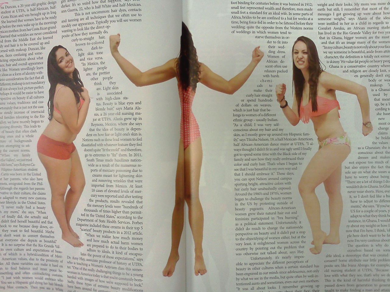
What you see on the screen is not what you see on the page.
I bet this looked great on the computer screen. This is an ambitious layout. Outlining text around the women’s figures is tricky and well done here. And I bet you could see the face of the middle model on the computer screen.
But the printed paper pages were bound together with glue to give the magazine a square spine. The pages don't lay flat, and there’s a gutter margin where you can’t see anything. And so we have a model who is all limbs.
This particular problem is not likely to arise on a poster, but the principle is the same. For posters, colours that look bright on your computer screen can look muddy in ink. Images that look fine at less than 100 pixels per inch on screen can look terrible when printed at 300 or 600 pixels per inch on paper.
What works in theory on the screen doesn’t always work in practice on the page.


No comments:
Post a Comment