

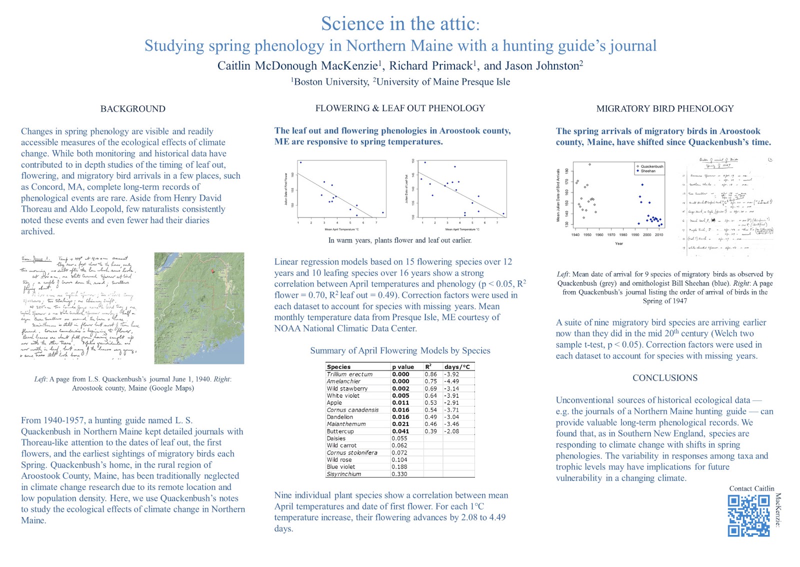
Caitlin’s poster has a nice clean layout. However, one thing that you can see by drawing a couple of lines is that the grid is not very tight, particularly in the left column, where the image sticks out further than the text:

Let’s start cleaning up. Shadowed text? No reason for it. It obscures the letter shapes in the title, where readability from a distance is critical. Also pulled out the colons from the sub-headings, since nothing is following them.

The next change I made was starting to work on the data prison in the table. Lots of vertical and horizontal lines went bye-bye:

I then lined up the table, and tweaked the figure captions. For instance, I spelled “L” and “R” as “Left” and “Right.” Abbreviations almost always make extra work for the reader (exceptions for super common ones, like DNA, where the acronym is better known than the words). If you have space, spell things out!

The biggest change in the next version was to emphasize the message in the central and right columns’ sub-headings. I did that in three ways.
- I made them bold, creating a cue that these sentences were important.
- I changed them from questions to statements, making it easier to get the point right away when scanning.
- I left aligned the text to make it more consistent with the paragraphs below, and to emphasize the grid.
The final changes were to adjust the spacing in the central column. I made the top two graphs a little larger, so their edges would be flush with the text below them. I also moved the QR code a bit to create a more comfortable space between it and the text. And a final adjustment to the figure legends, so that “Left” and “Right” start their own lines.
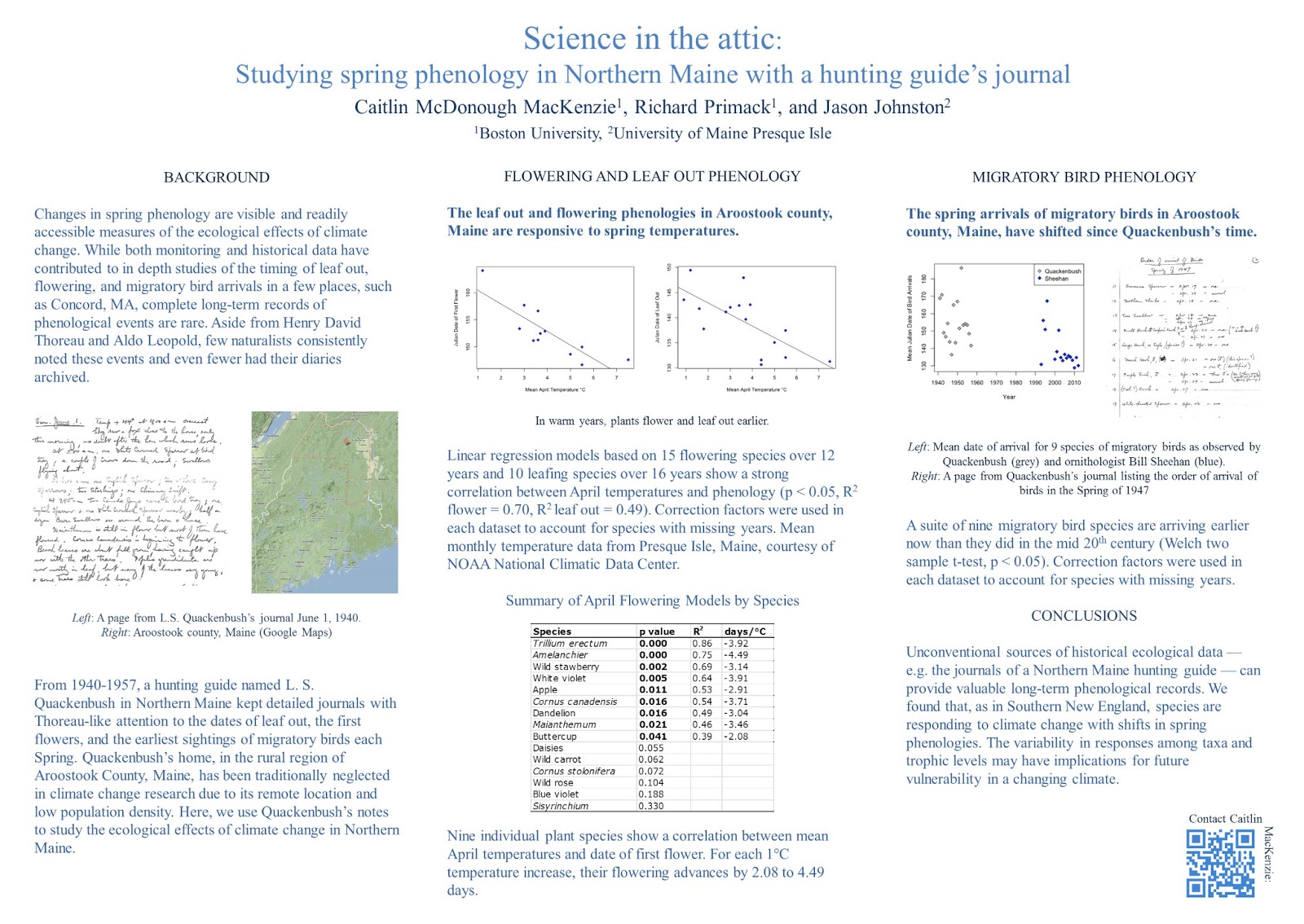
The final poster looks much like the first poster. All of these little changes together give it a cleaner, classier, more polished look. It’s all about the details.
Caitlin was happy with the end result:
Wow! Thank you so much! It’s amazing how much of a difference those little tweaks can make. I have a renewed appreciation for the power of design in communication.


No comments:
Post a Comment